Apex Chart
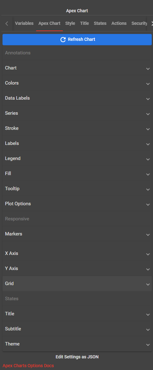
An apex chart displays information graphically, making relationships among the data easier to understand. Click Refresh Chart to update the chart to the actual data.

| Parameter | Description | ||||||||||||||||||||||||||||||||||||||||||||||||||||||||||||
|---|---|---|---|---|---|---|---|---|---|---|---|---|---|---|---|---|---|---|---|---|---|---|---|---|---|---|---|---|---|---|---|---|---|---|---|---|---|---|---|---|---|---|---|---|---|---|---|---|---|---|---|---|---|---|---|---|---|---|---|---|---|
| Chart |
Background Color Set background color for the chart area.Foreground Color Set foreground color for the chart area.Font Family Sets the font family for all the text elements of the chart. Defaults to 'Helvetica, Arial, sans-serif'Add Drop-Shadow Settings Click this to enable dropshadow.Add Toolbar Settings Click this to enable Toobar settings.Add Zoom Settings Click this to enable zoom settings.Add Sparkline Settings Click this to enable sparkline settings.Enable Width Settings Click this to enable width settings.Enable Height Settings Click this to enable height settings. |
||||||||||||||||||||||||||||||||||||||||||||||||||||||||||||
| Colors | Colors for the chart’s series. Click Add Color and click Color to pick a color. | ||||||||||||||||||||||||||||||||||||||||||||||||||||||||||||
| Data Labels | Enable the data labels to view it on the chart. The data labels are visible at each plot point on the line. They make it easier to view the data on the chart. | ||||||||||||||||||||||||||||||||||||||||||||||||||||||||||||
| Series | Accepts an array of [name, data] object for axis charts or an array of values for non-axis (pie/donut) charts. For more information on what formats are accepted, checkout Series configuration. | ||||||||||||||||||||||||||||||||||||||||||||||||||||||||||||
| Tooltip |
Enabled When enabled shows a tooltip when you hover over chart area.Enabled on Series Show tooltip only on certain series in a multi-series chart. Provide indices of those series which you would like to be shown.Shared When having multiple series, show a shared tooltip. If you have a DateTime x-axis and multiple series chart ‐ make sure all your series has the same “x” values for a shared tooltip to work smoothly.Follow Cursor Follow user’s cursor position instead of putting tooltip on actual data points.Intersect Show tooltip only when user hovers exactly over datapoint.Inverse Order In multiple series, when having shared tooltip, inverse the order of series (for better comparison in stacked charts).Fill Series Color When enabled, fill the tooltip background with the corresponding series colorTheme Choose between light or dark theme. |
||||||||||||||||||||||||||||||||||||||||||||||||||||||||||||
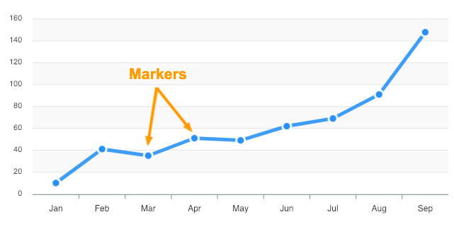
| Marker | Click Add Markers Settings. Marker Size Size of the marker point. In a multi-series chart, you can provide an array of numbers to display different size of markers on different seriesColor Sets the fill color(s) of the marker point.Stroke Color Stroke Color of the marker. Accepts a single color or an array of colors in a multi-series chart.Stroke Width Stroke Size of the marker.Stroke Opacity Opacity of the border around marker.Stroke Dash Dashes in the border around marker. Higher number creates more space between dashes in the border.Fill Opacity Opacity of the marker fill color.Shape Shape of the marker. Available Options for shape: Circle and Square.Radius Radius of the marker (applies to circle shape)Offset X Sets the left offset of the marker.Offset Y Sets the top offset of the marker. |
||||||||||||||||||||||||||||||||||||||||||||||||||||||||||||
| X Axis |
Type Available Options - category, datetime, and numericCategories Categories are labels which are displayed on the x-axis. Click Add Category to add more categories.Show Labels Show labels on x-axis.Rotate Rotate angle for the x-axis labels.Rotate Always Whether to rotate the labels always or to rotate only when the texts doesn’t fits the available width.Hide Overlapping Labels When labels are too close and starts to overlap on one another, this option prevents overlapping of the labels.Show Duplicates By default, duplicate labels are not printed to prevent congested values in datetime series. If you intentionally want to display same values in x-axis labels, turn on this option.Trim Append ... to the text when it cannot fit the available space and rotate is turned off |
||||||||||||||||||||||||||||||||||||||||||||||||||||||||||||
| Y Axis | Enable Y Axis Settings Show Y Axis Whether to display the y-axis or not.Show Always Whether to hide y-axis when user toggles series through legend.Show For Empty Series When turned off, it will hide the y-axis completely for a series which has no data or a series with all null values. |
||||||||||||||||||||||||||||||||||||||||||||||||||||||||||||
| Grid |
Show To show or hide grid area (including xaxis / yaxis)Border Color Colors of grid borders / linesStroke Dash Creates dashes in borders of svg path. Higher number creates more space between dashes in the border.Position Whether to place grid behind chart paths of in front. Available options for position: Front and Back. |
||||||||||||||||||||||||||||||||||||||||||||||||||||||||||||
| Title |
Text Text to display as a title of chart. It is displayed on top of the chart and informs you what data the chart represents.Align Alignment of title relative to chart area. You will be able to align it to the Left, Center, or Right.Margin Vertical spacing around the title text.offset X Sets the left offset for title text.offset Y Sets the top offset for title text.Floating Enable floating option to take out the title text from the chart area and make it float on top of the chart.Style Font Size Font Size of the title textFont Family Font Family of the title textFont Weight Font Weight of the title textLabel Color Fore color of the title text |
||||||||||||||||||||||||||||||||||||||||||||||||||||||||||||
| Subtitle | Click Add Subtitle Settings. Text Text to display as a subtitle of chartAlign Alignment of subtitle relative to chart area.Margin Vertical spacing around the subtitle textOffset X Sets the left offset for subtitle textOffset Y Sets the top offset for subtitle text |
||||||||||||||||||||||||||||||||||||||||||||||||||||||||||||
| Theme | Click Add Theme Settings. Shade Pick from Light or Dark theme.Palette Available palettes are listed below.
|