Slider
The Slider tab allows you configure the Slider widget.
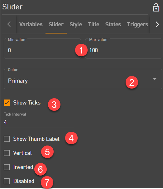
 Enter the minimum and maximum value of the slider.
 Pick a color for the slider.
 When you enable Show Ticks and provide a Tick Interval, it displays tick marks. Ticks represent increments within the range of values.
 You will be able to show the Thumb label. The Thumb label displays the exact selected value of a slider.
 By default sliders are horizontal with the minimum value on the left and the maximum value on the right. Select Vertical to make it vertical with the minimum value on bottom and the maximum value on top.
 Inverted enables you to flip the axis that the thumb moves along. An inverted horizontal slider will have the minimum value on the right and the maximum value on the left, while an inverted vertical slider will have the minimum value on top and the maximum value on bottom.
 Disable a slider to prevent user interaction. The disabled slider values are changed by the variable values it is attached to.