The Carrier connections pie chart widget is used to show the number of connections per carrier.
Configuring the widget
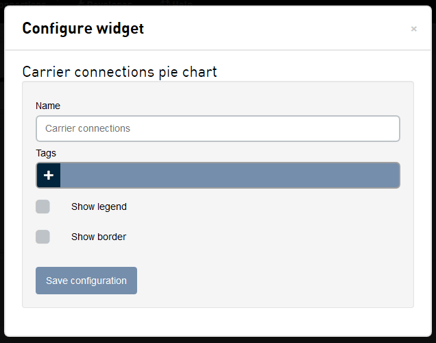
| Field | Description |
|---|---|
| Name | The name of the widget, shown at the top of the widget. |
| Tags | A list of tags used to limit the connections that are used in the pie chart. |
| Show legend | If a legend should be displayed at the bottom of the pie chart. Clicking on the color in the legend will toggle if that slice is displayed in the chart. |
| Show border | If the widget should have a border around it. |
Interacting with the widget
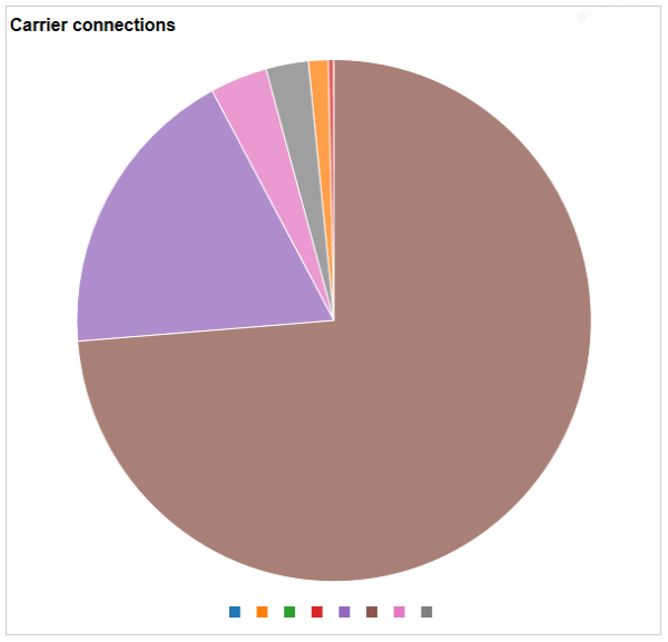
- When you mouse over a slice, the pie chart will highlight that slice and display the name of the carrier, the number of connections with that carrier, and the percentage of selected connections with that carrier.
- If you are displaying the legend, moving the mouse over a color in the legend will highlight that slice. Clicking on the color in the legend will toggle the slice on and off in the chart.