The Property time-series graph widget will display a sequence of values for a specific Thing property as it has changed over time.
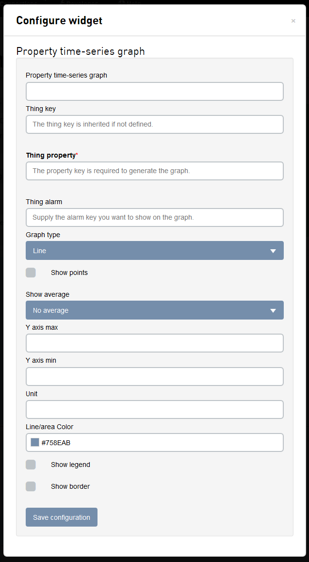
Configuring the widget
| Field | Description |
|---|---|
| Property time-series graph | The name of the widget, shown at the top of the widget. |
| Thing key | The Thing key this widget should respond to. If left blank, the widget will inherit the Thing key from the dashboard. |
| Thing property | The property of the Thing to be shown by the widget. |
| Thing alarm | The key of the alarm that will be overlayed on the graph. At the point in time when the Thing changes alarm state, a vertical line with the alarm state's color will be drawn on the graph. |
| Graph type |
Specifies how the property graph should be presented.
|
| Show points | If the points on the graph should have dots on the specific property points on the graph. |
| Show average | If the graph should show a line for the average property value. |
| Y axis max | The upper bound of values that should be shown on the graph. The property may have values that exceed this boundary and those values will not be visible on the graph. |
| Y axis min | The lower bound of values that should be shown on the graph. The property may have values that are lower than this boundary and will not be visible on the graph. |
| Unit | The unit of the property. Displayed in the upper right hand corner of the widget. |
| Line/area color | The color of the line/area representing the property value. |
| Show legend | If a legend should be displayed at the bottom of the pie chart. Clicking on the color in the legend will toggle if that series is displayed in the graph. |
| Show border | Click on the Show border check-box to show a border around the widget. |
Interacting with the widget
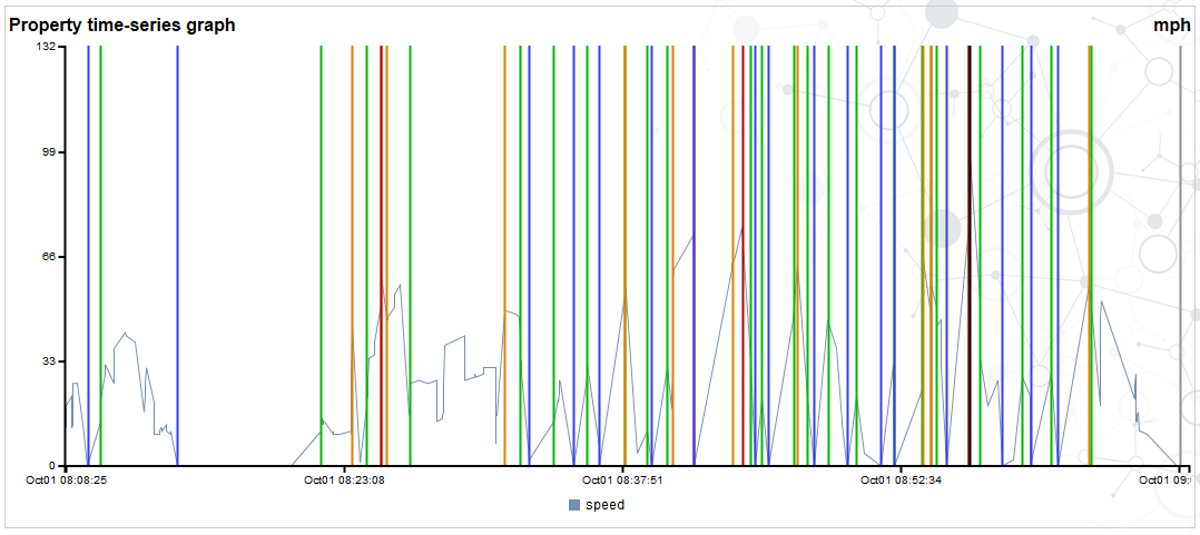
- If you are displaying the legend, moving the mouse over the legend will highlight the property on the graph. Clicking on the color in the legend will toggle the line on and off in the chart.
- Mousing over a point on the line will display the date-time, color, property, and value of that point.
- Mousing over an alarm vertical line will display the date-time, color, and alarm state.
Data Bracketing Algorithm
Graph widgets are subject to a data bracketing algorithm. This is done to alleviate excessive white space in the graph as a result of data gaps between the start of the time-series and the first data point, and the between the last data point and the end of the time-series.
- The average time interval is calculated for the number of points in the date range and then a 1.5 multiplier is applied to define an acceptable margin.
- If the first reported point occurs later than the graph's start date by an amount greater than the acceptable margin, an extra data point with the same first value will be inserted at the start of the time-series.
- If the last reported point occurs earlier than the graph's end date by an amount greater than the acceptable margin, an extra data point with the same last value will be inserted at the end of the time-series.
These extra data points are only inserted for the purpose of the display. On refresh of the graph, these extra data points are not retained. The data bracketing algorithm is applied again on the new time-series data set to determine if extra data points are required.