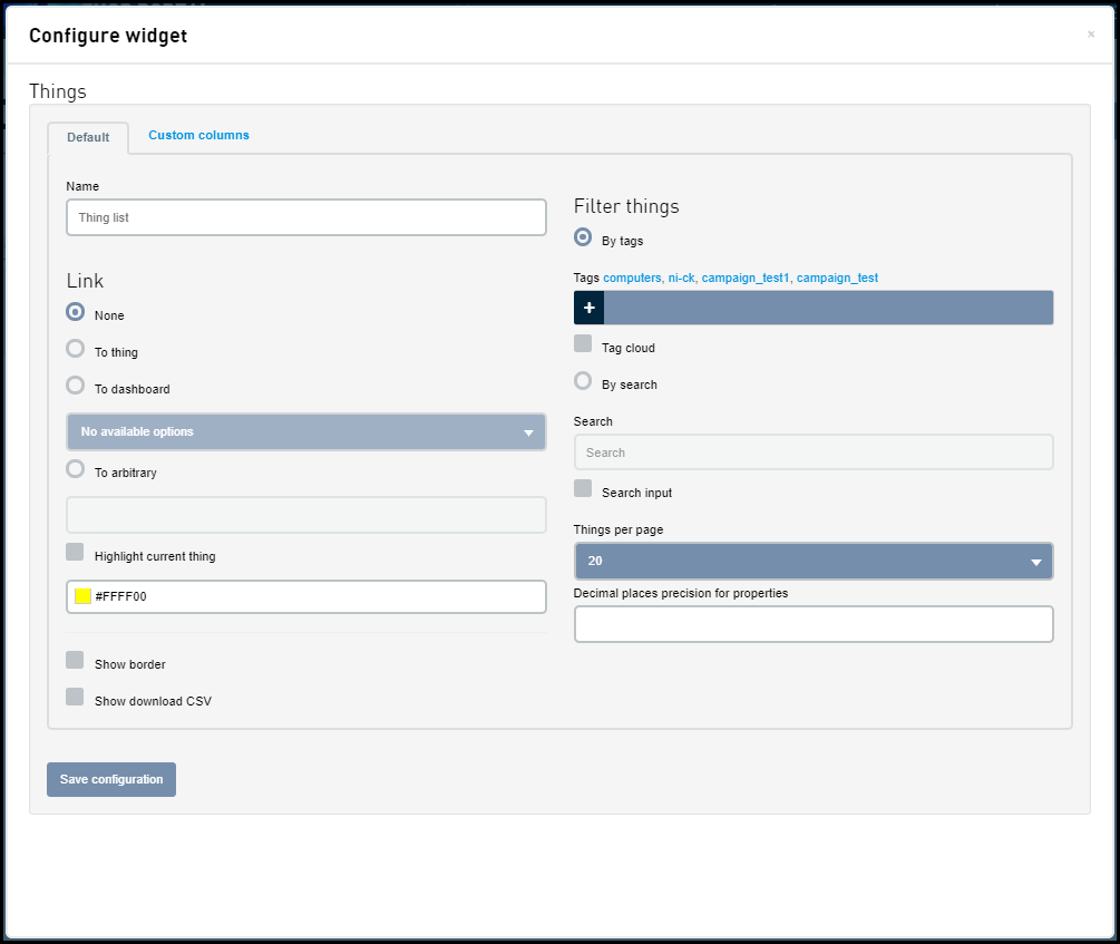
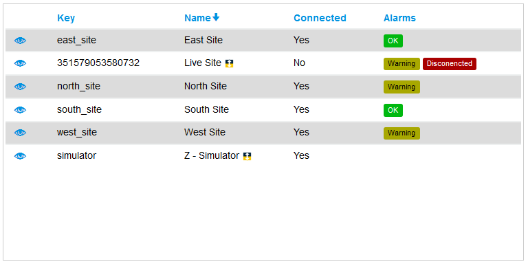
The Things list widget displays a list of Things.
| Field | Description |
|---|---|
| Name | The name of the widget, shown at the top of the widget. |
| By tags | An option to display a list of tags used to limit the Things that are displayed in the Things list widget. |
| Tag cloud | An option to display a tag cloud in the Things list widget. For more information about the Tag cloud, see Tag cloud. |
| By search | Enable this option so that you will be able to enter search criteria. Only the Things that meet the search criteria gets listed in the widget. For more information on how the search works, see Using Search. |
| Search input | Enable this option to view a search bar in your widget. |
| Things per page | This widget supports pagination. Select the number of Things to display per page. |
| Decimal places precision for properties | Specifies the number of decimal places to display to the right of the decimal point. |
| Link | An option to display a link.
|
| Show border | An option to have a border around the widget. |
| Highlight current Thing | Select this option to highlight the current Thing. The color selector below is to select a color in which the current Thing will be highlighted. |
| Show download CSV | Enable this option to view a Download CSV option in your widget. |
| Custom columns | Specify the list of columns
available to be displayed in the
widget.
|
 is
not displayed.
is
not displayed.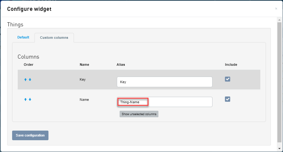
| Widget | Interacting with the widget |
|---|---|
|
|